Pretty Inspirational

>> Friday, September 23, 2011

Sally Wheat

Here's a great designer I've recently fallen for via Cote De Texas who featured her Huston home back in 2008.  Her style has a wonderful, subdued elegance that I just had to share.  So here you go - be inspired:


All images are from sallywheatinteriors.com.

Read more...

Design Seeds

>> Saturday, September 17, 2011

Gotta share this blog I've just fallen in love with.  Design Seeds: Beautiful pictures become pretty color palets.  I've been looking through the interior lens but these would work for anything that needs an inspired color scheme.  Here are some of my favorites:


Enjoy!

Read more...

Unexpected Inspiration

>> Wednesday, September 7, 2011

It's funny where you'll be when something catches your eye.  I found a shirt the other day that did just that. Actually there were two but we'll just talk about one for now.  I don't really care for it as a shirt, mainly because it look like a decorator's idea board.  But as a decorator's idea board I love it.


See what I mean?  There are so many details that I'm really attracted to in this.  So here is my translation for a guest or girly bedroom:

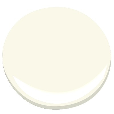
 The tonal green background is so good.  Any of those would make a great wall color.  I'm choosing the lighter shade: Benjamin Moore's Harbour Town.  And Mascarpone for the trim (because I'm a traditionalist at heart and like "white" trim).


The curtains bring in the darker green.  I typically go with basic panels and I think that's the way to go on this one too. The first is a linen from Fabric.com.  Linen is thin though, so pairing it with a Roman shade in the second would be a very practical choice.


Clearly all bedrooms need a bed.  When I started down this path, I envisioned it with my grandmothers iron bed.  It's white with brass finials.  Restoration Hardware has a beautiful one too though (with a surprisingly reasonable price).


The bedding could go a few different ways.  One is to do a basic cream quilt and layer it with pillows incorporating the accent colors - very safe.  Another would be to go with the litteral interpretation using a pink floral and navy pillows.  Like this:

Premier Prints Dandelion White/Candy Pink
      

Problem with this concept is it tests my life rule forbidding floral prints.  Jury is still deciding if dandelions are flowers.  So third option is this pretty print and cream pillows with a shot of the navy.


I realize it's a little floral too, but I think it's more of a leaf motif than flower.  

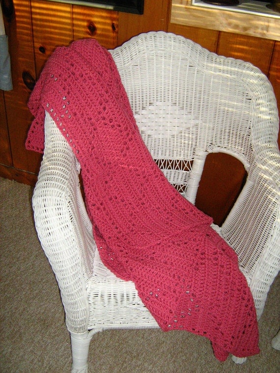
Finally on the bed a cozy throw.  I like bringing the pink back in and this one has a great vinage quality to it even though it's new.


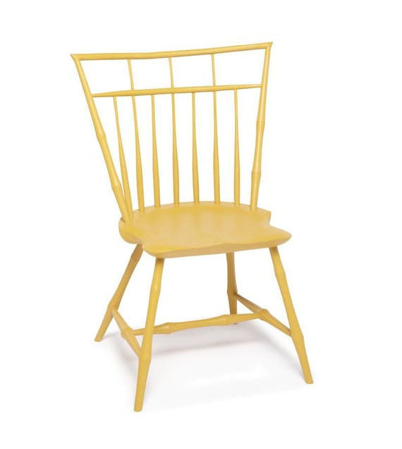
Next, I believe all good rooms need somewhere to sit and we need to incorporate the turquoise pattern in the upper left corner.   So I'm thinking something like this birdcage chair painted Aruba Blue.  (But Good Lord not for $750 like this exact option).


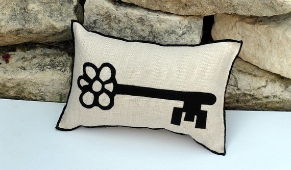
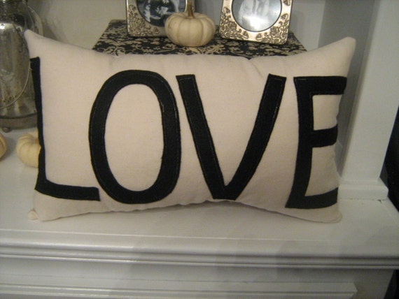
I would also include a pillow on the chair.   Likely incorporating the black and cream.  Something like these:


In the vicinity of this chair and table I'd hang this:


Wouldn't that be a cute reminder everyday? 

Clearly this room needs all of the details but I think it's a good framework.  Hopefully in the not-so-distant future it will become a real room.  We'll see. 

Read more...

A Place to Lay My Head

>> Monday, September 5, 2011

I so desperately want a new headboard.  We're still using one that came with a set of bedroom furniture that was purchased second hand when we first got married.  I didn't like it then, and in five years, it hasn't grown on me at all.


SO... I'm tossing around a few ideas.  One is an upholstered bed like this one from Room and Board.  Love the clean lines.  

If I did just the head board though, I could make it my self.


Like this simple one from Coastal Living (Also love the colors in this room).

There are a million shape options though.  Like these:


I also love tufting.  I don't think it would be that hard either.


My only real requirement is that it doesn't end up looking too formal - or a too traditional styling.  Leave it to Sarah Richardson to solve that problem for us though.


The bright color palet and fun pattern make it anything but frumpy.  Isn't she great at mixing patterns?  Here's another Sarah Richardson room:


Love it!

Read more...

A Curb Appeal Redo

>> Saturday, September 3, 2011

It amazes me how much you can change the look of a house.  Here was the house we started with on Cambridge.


It's a cute bungalow except for the dingy screened porch and boring paint scheme.  But we had big plans for this one.


First - the destruction of the screens.  It made the brick pillars show up and instantly lightened the entire house.  This may have been the most transforming two hours of the entire renovation.


Next came paint.   I love that paint.  The yellow came across so generic - it didn't help that three other houses on the block were painted the exact same color.  The white trim was in good shape and matched the (unpaintable) vinyl windows pretty perfectly, so all that needed painting was the brick and front door.


Finally I limbed up the tree in the front yard.  Actually took out a huge, but skinny limb.  It was also a really easy afternoon project.  This made a much bigger impact than I anticipated - totally should have done it sooner.


Here's the porch "after."  The door is painted a Martha Stewart color called "Falling Leaves."


Can you believe the change?  The amazing thing is the only part that cost anything was the exterior paint, and, because we didn't paint the trim, that wasn't too bad.

My biggest take away was limbing the tree.  If a house looks dark from the front, or if a tree is looking sickly or a bit wily, try giving it a haircut.  It's amazing what it will do for the curb appeal.

Read more...