Easy Peasy DIY Picture frame

>> Wednesday, August 31, 2011


This DIY is so easy it doesn't even justify a tutorial.   However, I still wanted to share because it just came out so good.  I started with these sticks found on the beach.


They are actually part of the fencing used to rebuild dunes like here:


I guess it's being beaten by the sand and wind and bleached by the sun but they have a perfect patina.  I love it.  Plus they are very easy to come by (if you happen to be at a beach), and broken pieces tend to pile up with the shells and drift wood. 
Ok back to the task at hand...  I mitered the edges then used wood glue to glue them together.   A (very, very) ugly frame had to be disassembled for parts.  So I glued my beach wood to the back of the sacrificed frame:


 and voila!


Read more...

I'm thinking about a Farmhouse Kitchen

>> Wednesday, August 24, 2011

Doesn't it look like fun!


Haha no really.  I'm thinking the kind with a big table in the center.
Like this:


Read more...

The Hall Bathroom

>> Friday, August 19, 2011

Welcome back to the room by room total house remodel.  In today's episode: the hall bathroom.  This is a typical bungalow bathroom (read: very small).  It was blessed with a very low rent redo maybe 15 years ago - it all had to go.


Except for the cast iro bathtub - it was the 1920's original and in pretty good shape.  The tile though - not good.


The tile went about 5 feet up the wall and removing it trashed the plaster beneath.  We choose to go back with board and batten wainscoting.  It's a high value look with a low price tag.  


It was a bit of a learning experience though.  We used drywall and pine trim.  We should have used quater inch plywood and MDF trim (a bit of foreshadowing for the next house).  The drywall added an extra step of mudding and sanding, and the raw wood added the extra step of lots of sanding and lots of priming.


At the end though a good coat of paint - high gloss trim in Halo and semi gloss walls in Stratton Blue (both Benjamin Moore colors) - and new fixtures and it all came together.


 Despite the work, it came out really nice if I do say so myself.

Read more...

Dream Home 2011 - The Kitchen

>> Wednesday, August 17, 2011

This is the kitchen I am currently drooling over.  First thing that struck me: it's not big - 12ft by 9ft I think.  Maybe that's why I like it, I could do this.  Let me tell you though, they have packed a lot of good into this small space.


The second thing the stuck out (after how small this was), is those goose neck lights.  There's one over the sink too.  I wonder if they are the only lights in the room or if they still included cans.  I think you'd need a few cans down the middle, but I love the placement of these as task lights over the work surfaces.

The symmetry in here is great too.  I big on symmetry in a kitchen.  There are so many components to a kitchen that  it gets chaotic without symmetry to hold it down.  By the way, that upper cabinet by the stove is a medicine cabinet - I'm still not sure how I feel about it.


However, the other upper cabinets are perfect!  The dark stain makes them look like furniture - nice furniture.  And I love that they go down to the counter.  I also really like the lower cabinet color and how that ties into the graining in the marble countertops.  

Other details worth imitating: they covered the dishwasher with a cabinet panel - I'm guessing to maintain symmetry; and the refrigerator  is a cabinet depth model so it won't invade the traffic flow.


Behind the kitchen is this precious breakfast nook.  The table and chairs are wonderful!  And I've always loved the Harmon Pendant from Restoration Hardware.   I'm also in love with those doors - their scale is so good.

Another neat detail: the horizontal boards around the entire room and kitchen.  It gives it dimension and, in the kitchen, eliminates the need for a backsplash.  Painted high gloss it would be easy to wipe off and keep clean.


Adjacent to the breakfast nook is the pantry with a coffee station, I think.  They switched up and used a dark, presumably granite, countertop back here - I wonder why?  Fear of the marble staining under the coffee?  Regardless it looks beautiful and the little light above is great too.

So that's the kitchen of my "love every detail" dream home.  Hope it inspires!

This is a home that was listed for sale and the pictures are copyright FMLS 2011

Read more...

The Kitchen Remodel

>> Monday, August 15, 2011

 Now this is the good stuff.  


I love kitchens.  I REALLY love designing kitchens.  It's like a puzzle: what pieces go where to get the right drawers and the right shelves in the right place. 


 It also has to take into account the utilitarian nature of the kitchen.  How many people will need to work here?  Creating stations for specific tasks.  Getting the flow right for both the cook and the people passing through.  


Maybe too I like it because it's high risk.  If you don't like the sofa placement, you move it.  Once cabinets are install though, you're quite a bit more committed. 


There are a lot of things I loved about this kitchen.  One was that mirrored pantry door.  It had this worn green glaze on it that had aged perfectly.   Such an awesome find at the salvage yard.


I also loved the bead board backsplash (It was not that hard to do), and that faucet.  It's one with the pull down nossel.  So useful. 


Let's remember where we began on this one shall we?


So this is where we started.


Everything was removed


Including that awful linoleum floor.


The pantry and laundry were framed in.  The back door was also moved over to allow for the laundry.


When the cabinets were delivered they literally had to be stored in every room.  This is the bedroom.


Drywall installed, cabinets installed, plumbing and electrical done.  Countertops came shortly after this picture.


Then lot of details and we had a finished kitchen.

Read more...

Adding a (much needed) Bathroom

>> Thursday, August 11, 2011

Welcome back to renovation memory lane.  We last left off here:


The suspense was killing you - I know.  What on earth is going on.  Well this little bungalow had one bathroom and 1250 square feet (thus nowhere inside to add another bathroom).  So we decided to put one on the back.  We went from here...


To here...


To here in about 4 months.  Whew...


And here's what we ended up with.  A double vanity (because I don't like to share).


And a huge shower because it's awesome.


And an even huger second closet (because I don't like to share).

This was SUCH a learning experience.  We had the entire project done by a general contractor but there are so many decisions that had to be made (and usually they needed making within the hour). 


So here's what I learned from the bathroom project:

1.  Additions are not that big of a deal.  Relatively speaking they aren't that expensive either.  We ballpark $100 a square foot finished (but not over the top finished and that doesn't include bathroom or kitchen fixtures).

2.  Never put the shower sprayer on an exterior wall.  It will freeze every. single. time.

3.  Save money by just having the top of the shower glasses in.  It still has the open, not-so-claustrophobic feel of a glass shower, but the wall and tile are much less expensive than the huge piece of tempered glass.

4.  Use kitchen cabinets to make a vanity.  The size and layout options are much greater, and the vanity is a bit taller.  The installer did have to cut the backs down so they would be vanity depth (22 inches) not kitchen counter depth (24 inches) but it wasn't an issue at all.

5.  Travertine tile weighs a ton.  No literally.  And it will not fit in the back of your compact.  Even if it will fit in the trunk, the car will not be able to move.  Plan accordingly.

6.  A huge closet (that you don't have to share with a man) that has a great mirror and ottoman is a wonderful thing.  I actually also had a dresser in there so it really was a private dressing room.


Why, oh why did we sell that closet?  I mean that house.


Read more...

Dream Home 2011

>> Wednesday, August 10, 2011

Do you have inspiration pictures that you go back to over and over again?  And every time you look you find something new to love?  


 I mean the few that you completely dissect - go inch by inch looking at each item and how it's placed.  Hold it up in the light hoping to read the titles of the books on the coffee table.  


 For me, this is that house! I love every thing about this house.  No kidding - every. single. thing.


I love the contrasts between the white walls and the dark wood - both the hardwood floors and most of the furniture.  And the huge stick that's so artistic.


I especially love the contrast of the dark window mullions and doors.


I love the dark painted ceiling throughout the house that are so dramatic in the white rooms.  


I love that all of the drapes are hung just under the crown molding - to give the room height. And I love that there isn't to much fussy stuff on the dining room table too.  It's as if they use their dining room table


Oh... Wow.  First, I love that there is a fireplace in the dining room.  Wouldn't that be cozy for Christmas Eve dinner?  Second, the display on top is perfect.  It doesn't have too much but it is such a focal point.  I would have thought the wheel would be too big - but it balances the blackness of the fireplace.  And, again, is so sculptural against the white trim. 


Oh that trim!  This is a hallway.  Who loves a hallway?  But this is such an elegant hallway.


 And I love the bathroom off of that hallway.  It has a chandelier - but not a crystal, fru-fru, princess chandelier.  An wonderfully understated, elegant chandelier that reflects off of those dark walls and ceiling.


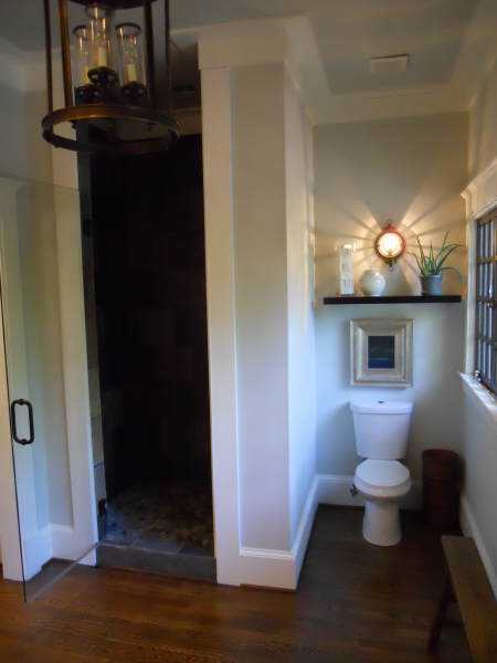
Don't think they skimped in the master bathroom either.  It also has a wonderfully elegant chandelier.  Actually, it might be the same one.  The only tile, in the entire house mind you, is the slate in the master shower that stands out perfectly from the rest of the master bathroom.  
Oh, and I love the display over the toilet - making a dark hole bright and pretty.


I love the vanity mirrors too.  They are "framed" with trim.  Being so tall and narrow gives more height illusions (even though this house has pretty high ceilings to begin with).  Interesting too that there is only a single sconce.


Finally, I love that the basement (yes this is the basement) doesn't look like a basement.  It's so cohesive with the upstairs that it could never be mistaken for a typical basement rec-room.  Here I love the layering of rugs, the medium gray wall color and the glossy, bead board ceiling.


See what I mean about loving this house?  So many times there are things you just can't recreate at home (like the abundance of windows and the high ceilings), but here are my take aways from this house that I am bound and determined to imitate:

~ Dark painted (but not quite black) window mullions & doors
~ Large chandeliers in the bathrooms
~ Tall wainscoting & trim where possible
~ A bright display over the toilet
~ A cohesion in color, formality, and style throughout the house 

Oh, incase you we wondering: no the kitchen does not disappoint.  It is so wonderful it deserves its own post.  To be continued...


This is a home that was listed for sale and all pictures are copyright FMLS 2011.

Read more...